Building a Consistent HA Dashboard with Glassmorphism — The CSS That Actually Works
The six CSS constants I use across every card on three Home Assistant dashboards, plus the patterns for progress bars, map cards, and suppressing the Frosted Glass Dark theme's ::before overlay.
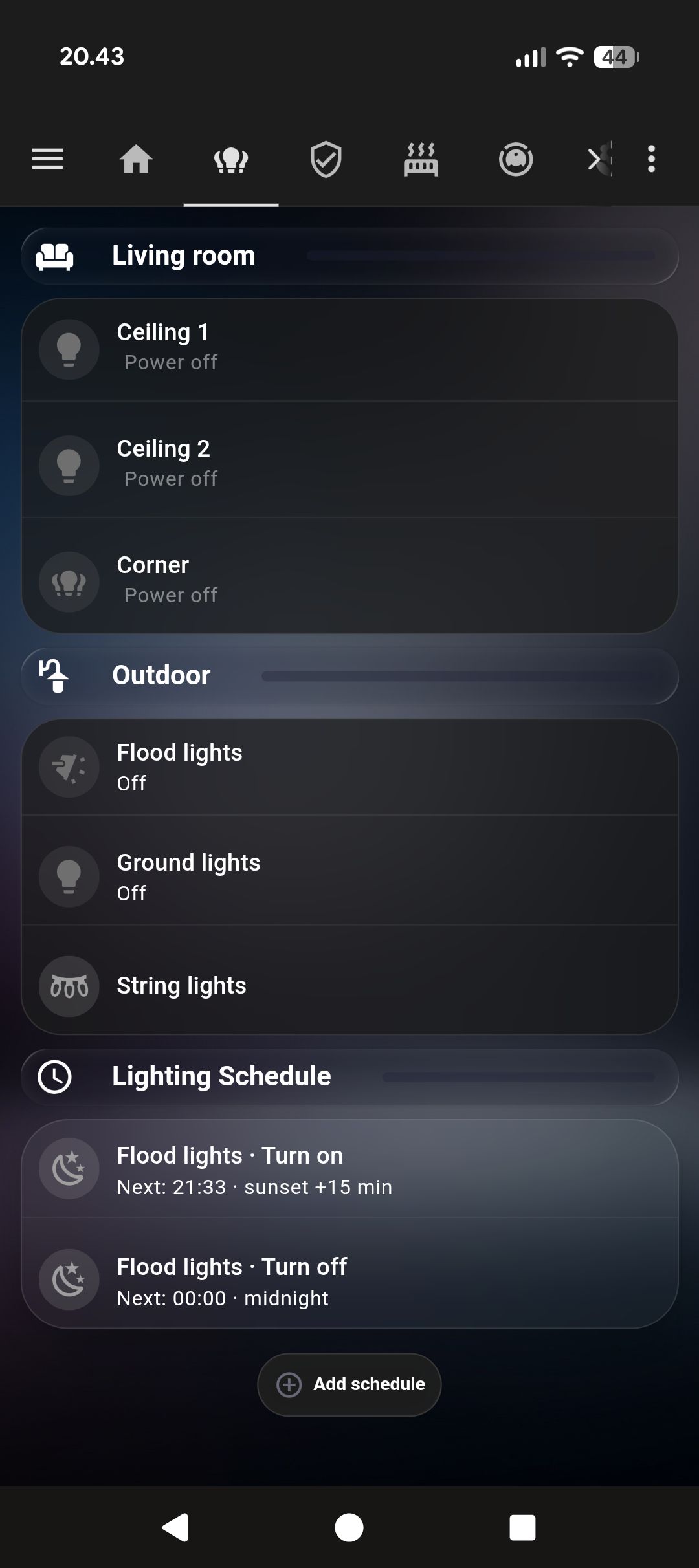
I rebuilt my Home Assistant dashboards three times before they looked like they belonged together. The first version was Tailwind-ish flat cards. Fine. The second was too many colors. The third landed on glassmorphism — translucent frosted cards on a deep navy background — and I’ve left it alone since.
What follows is the exact CSS, with the things that tripped me up explained.
The six CSS constants for every glassmorphism card
Every outer card uses exactly these values. No variation.
border-radius: 28px;
background: rgba(255, 255, 255, 0.05);
backdrop-filter: blur(15px);
-webkit-backdrop-filter: blur(15px);
border: 1px solid rgba(255, 255, 255, 0.10);
box-shadow: 0 8px 32px rgba(0, 0, 0, 0.3);
And the one you’ll miss if nobody tells you:
ha-card::before { display: none !important; }The Frosted Glass Dark theme (available in HACS under Themes, and several similar themes) injects a ::before overlay onto every ha-card. If you don’t suppress it, your custom background gets a semi-transparent overlay on top. The symptom is that your cards look slightly wrong — slightly too opaque, slightly off-color — and you can’t figure out why.
The outer card template
type: custom:stack-in-card
card_mod:
  style: |
    ha-card {
      background: rgba(255,255,255,0.05) !important;
      backdrop-filter: blur(15px) !important;
      -webkit-backdrop-filter: blur(15px) !important;
      border: 1px solid rgba(255,255,255,0.10) !important;
      box-shadow: 0 8px 32px rgba(0,0,0,0.3) !important;
      border-radius: 28px !important;
    }
    ha-card::before { display: none !important; }
cards:
  # content goes here
custom:stack-in-card (HACS) is the wrapper. All visual styling lives here. Inner cards get none of it. card_mod (also HACS) is what makes the CSS injection possible.
Inner cards — transparent only
Cards nested inside the glass wrapper should disappear visually:
card_mod:
  style: |
    ha-card {
      background: transparent !important;
      box-shadow: none !important;
      border: none !important;
    }
    ha-card::before { display: none !important; }
The ::before suppression is needed on inner cards too. The theme applies it everywhere.
Between inner cards, I use a faint divider:
border-bottom: 1px solid rgba(255, 255, 255, 0.06) !important;Lighter than you’d expect. If it’s too visible it cuts the glass surface. At 0.06 opacity it reads as a section break without drawing attention to itself.
Progress bars via ::after
::before is taken by theme suppression. ::after is yours for content.
card_mod:
  style: |
    ha-card {
      overflow: hidden !important;
      position: relative !important;
    }
    ha-card::before { display: none !important; }
    ha-card::after {
      content: '' !important;
      position: absolute !important;
      left: 0; top: 0;
      width: {{ states('sensor.battery_level') | int(0) }}% !important;
      height: 100% !important;
      background: linear-gradient(90deg,
        rgba(76, 175, 80, 0.18),
        rgba(129, 199, 132, 0.05)) !important;
      pointer-events: none !important;
    }
The gradient fades right, so a card at 30% looks different from one at 80% in a way that reads intuitively. I use this for EV battery level, vacuum battery, and mower battery. For maintenance sensors I invert the color logic — near 0% means warning, so I use a red gradient.
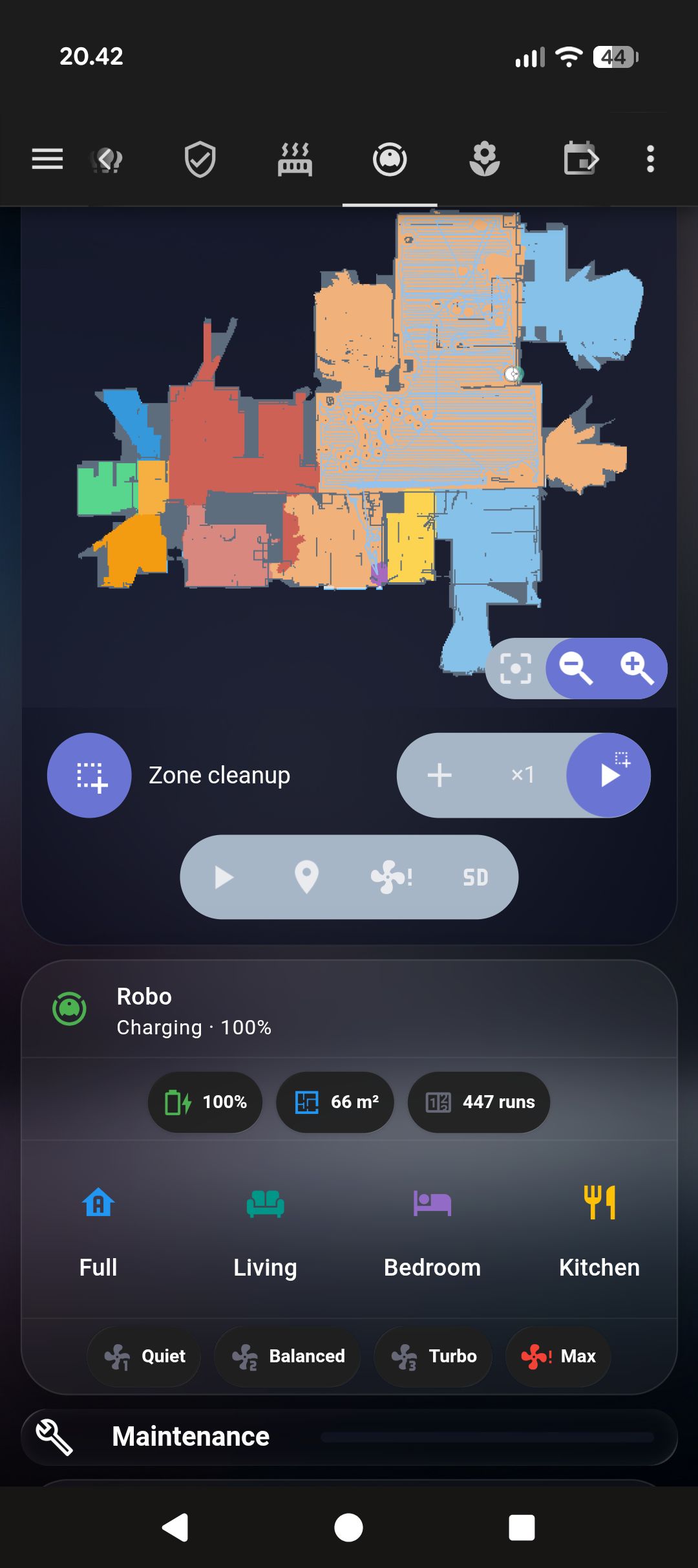
Map cards
Map cards have their own rendering rules. Put one directly in a glass stack-in-card without adjusting it and you get square corners poking outside the rounded wrapper.
The fix: overflow: hidden on the outer card, border-radius: 0 on the inner map card. The outer’s overflow does the clipping.
type: custom:stack-in-card
card_mod:
  style: |
    ha-card {
      /* standard glass values */
      overflow: hidden !important;  /* this is the key line */
    }
    ha-card::before { display: none !important; }
cards:
  - type: custom:xiaomi-vacuum-map-card  # HACS
    entity: vacuum.robot
    card_mod:
      style: |
        ha-card {
          border-radius: 0 !important;
          box-shadow: none !important;
          border: none !important;
        }
Badge suppression
Mushroom cards show colored badges on certain states — the orange “unavailable” badge when a device is offline is the main offender. It clashes with everything.
card_mod:
  style:
    ".": |
      mushroom-badge-icon.unavailable {
        display: none !important;
      }
The "." key is the correct one for mushroom cards in HA 2024+. Not ha-card, not the component name — ".". I spent longer than I’d like to admit testing other selectors before this one worked.
Achieving visual consistency across HA dashboards
YAML doesn’t have variables. Every card that uses the glass treatment gets its own copy of those six CSS lines. When I want to adjust the background opacity across the whole dashboard, I change it in 25 places.
My workaround: a snippets.yaml file sitting in my config folder with the full outer card template as a comment. Paste from there when creating new cards. It’s not elegant but it’s maintainable.
The right solution is custom CSS properties in the theme — var(--glass-bg) defined once, referenced everywhere. This works if you maintain a custom theme YAML. I haven’t made that leap yet.
For a full working example of these patterns applied to a real dashboard — glass cards, badge suppression, section dividers — see the Tado climate dashboard post.